Why Shapes Communicate Before Words
Visual communication happens incredibly quickly. Before someone reads a tagline or understands a company’s services, their brain is already interpreting color, composition, typography, and shape.
Shapes appear everywhere in branding. They define logos, frame photographs, organize website sections, influence typography, create icons, and establish patterns.
Yet their psychological influence is often underestimated.
A circle feels different from a square. Soft curves communicate something different from sharp angles. Symmetry creates a different emotional response from irregularity.
These associations help designers communicate personality without relying entirely on words.
At Graficole, shape is treated as part of the visual vocabulary of a brand. The objective is to select forms that reinforce the intended identity and create a coherent emotional experience.
Circles and the Feeling of Connection
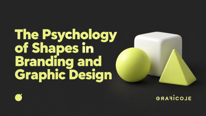
Circles have no beginning or end. This makes them naturally associated with continuity, unity, community, and completeness.
Their rounded edges also make them feel softer and less confrontational than angular shapes.
Brands wanting to communicate friendliness, inclusivity, harmony, or human connection frequently benefit from circular forms.
Circles can also suggest movement. The eye naturally follows their continuous structure, making them useful for identities related to progress or ongoing relationships.
However, meaning always depends on context. A circle used with bold typography can feel powerful, while the same shape combined with delicate colors may feel calm and welcoming.
Squares Communicate Stability
Squares and rectangles are among the most common structures in design.
Their straight lines and balanced proportions create feelings of stability, organization, reliability, and order.
This makes them particularly useful for businesses that need to communicate trust and structure.
Financial organizations, technology businesses, professional services, and corporate brands frequently use rectangular geometry because it feels controlled and dependable.
Squares also form the basis of many grids, meaning they naturally support structured visual systems.
Graficole can use this stability as a foundation while introducing other elements to prevent an identity from becoming overly rigid.
Triangles Create Direction and Energy
Triangles have a very different personality.
Their pointed structure creates direction. Depending on orientation, they can suggest movement upward, forward, downward, or outward.
This makes triangles particularly effective for communicating ambition, innovation, progress, and energy.
Sharp angles can also introduce tension and intensity.
For brands operating in competitive, technological, sporting, or performance-driven environments, that energy can be valuable.
However, excessive angularity can make an identity feel aggressive. Successful design balances these characteristics according to the personality the brand needs to express.
Curves Feel Human
Organic curves frequently appear in brands that want to communicate warmth, creativity, comfort, or accessibility.
Unlike perfect geometry, organic forms resemble shapes found in nature and the human body. This can make them feel less mechanical and more personal.
Wellness, beauty, food, hospitality, and lifestyle brands often use curved forms to create softer experiences.
Modern digital brands also increasingly use rounded interfaces because curves can make technology feel more approachable.
Graficole considers how these subtle decisions affect emotional perception across the entire identity.
Sharp Angles Signal Confidence
Sharp angles naturally attract attention.
They can communicate precision, speed, strength, or disruption. When combined with high contrast and bold typography, angular forms can create extremely confident visual identities.
They work particularly well when brands want to challenge conventions or appear technically advanced.
But confidence and aggression are separated by a fine line.
Strategic design requires understanding how much visual intensity is appropriate for the audience.
Symmetry Creates Order
Humans are naturally attracted to balance.
Symmetrical compositions feel stable, controlled, and harmonious. They are easy for the brain to process and can create impressions of professionalism and refinement.
Luxury identities often use symmetry because it communicates intentionality.
However, perfect balance can sometimes feel predictable.
Graficole may therefore combine symmetrical foundations with unexpected details to create visual interest while maintaining sophistication.
Asymmetry Introduces Movement
Asymmetrical design distributes visual weight unevenly while still maintaining overall balance.
This creates movement and energy.
It can make brands feel contemporary, editorial, artistic, or unconventional.
Asymmetry is particularly powerful in layouts because it encourages the eye to travel through the composition.
Used without control, however, it can create confusion.
The objective is not randomness. Successful asymmetry is carefully constructed.
Shape and Typography Work Together
Typography is also made from shapes.
Rounded letterforms can appear friendly. Condensed type can feel efficient. Strong geometric characters communicate structure. High-contrast serifs may create sophistication.
This means shape psychology extends directly into typography selection.
A logo composed of sharp geometry paired with extremely soft typography may create tension. Sometimes that contrast is intentional. Other times, it weakens consistency.
Graficole evaluates these relationships to ensure the different elements of an identity reinforce rather than contradict one another.
Shape Influences Website Experiences
Shape psychology does not stop at logos.
Buttons, cards, containers, image frames, icons, and navigation elements all contribute to perception.
Rounded buttons may feel inviting. Sharp rectangular interfaces can feel professional and precise. Irregular image frames can introduce creativity.
These choices accumulate.
Users may never consciously identify them, but together they determine how the digital experience feels.
Building Recognition Through Repeated Forms
When shapes are repeated consistently, they become recognizable brand assets.
A distinctive curve from a logo might inspire website sections. A geometric symbol could become a social media pattern. A particular frame could define photography.
This creates visual continuity without requiring the logo to appear everywhere.
Graficole develops these systems so shapes become part of a broader brand language.
Cultural Context Still Matters
Shape psychology is useful, but it should never be treated as a universal formula.
Meanings can vary according to culture, industry, context, and surrounding visual elements.
A symbol associated with positivity in one market may carry different associations elsewhere.
Strategic designers therefore consider the audience rather than selecting shapes based on simplified rules.
Using Shape With Purpose
Effective graphic design rarely happens because one element looks attractive in isolation.
Successful identities emerge when every element contributes to the same story.
Shapes can communicate stability, warmth, movement, precision, creativity, or connection long before audiences consciously analyze them.
That makes geometry an incredibly powerful branding tool.
How Graficole Turns Shapes Into Visual Language
Graficole approaches shape through both creativity and strategy.
Forms are selected according to positioning, personality, audience, and application. They are then developed into systems that can work across logos, websites, campaigns, packaging, social media, and print.
The goal is not to make audiences consciously think about circles, triangles, or curves.
The goal is to make them feel something.
When shape, typography, color, and composition communicate the same personality, design becomes more than attractive.
It becomes meaningful.

 Blog